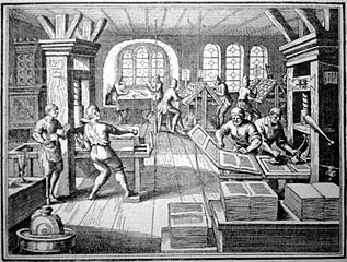
I’LL TELL YOU A STRANGE THING—TYPOGRAPHY, AND LAYOUT IN GENERAL, IS EXTRAORDINARILY IMPORTANT TO ME

On the face of it, it shouldn’t really matter what typeface you write in.
The meaning of words doesn’t change regardless of how they look, after all.
Or does it?
Pre-computers. the industry standard was Courier 12. Post computerization, more flexibility is tolerated where book manuscripts are concerned—but if you want to have a snowball’s chance of selling a screenplay, you would be decidedly unwise to deviate from Courier 12.
It’s clunky, and not proportional, but it is what the movie industry expects and is comfortable with. And it is worth remembering that the movie industry, for all its cutting edge technology and relative youth, is nothing if not conservative.
I’m not a typographer, and have never been trained in layout, but I confess I’m much more comfortable when I’m working with a typeface I like, and a layout I find visually appealing.
The layout of this blog—for better or for worse—reflects my taste. You would be amazed—or perhaps appalled—at how much work I did to achieve this simple result.
Yes, I know both faces may be considered unoriginal—but they meet my objectives: (1) To be be clear and readable. (2) To be aesthetically pleasing.
QUOTE:
"Opinions are made to be changed -- or how is truth to be got at?"
-- Lord Byron,
British poet
No comments:
Post a Comment