A TENTATIVE FIRST ATTEMPT TO START (no more) WRITING A BRIEF FOR MY NEW LOGO
 Funnily enough, I have written many a design brief in my day. I started with pack designs when I worked for United Biscuits in the UK (where a biscuit is what in the U.S. is called a cookie).
The results were generally excellent because I was working with a thoroughly experienced designer who knew all the parameters in detail—and kept me out of trouble.
My later experiences were more mixed, though I had a very good run when I worked with a designer called John Drewry (who is also an actor of considerable talent-and a friend for decades). John’s work, if not necessarily great design, was consistently commercially effective. He was, in essence, a graphic problem solver—and doubtless still is. And he is blessed with a great sense of humor.
All in all, I seem to have initiated much competent work, but I cannot say, with honesty that a single, truly great logo emerged (though two came close). That said, such briefs did, on occasion, result in some extraordinarily effective advertising—but I have also been bitterly disappointed.
Either way, I think it is no more than common sense for a client to try and write as clear a brief as possible. Since many clients neither quite know what they want, nor can write in the first place, clear briefs are the exceptions rather than the rule. It is not easy being being a graphic designer.
My sense is that it helps greatly if there is some chemistry between client and designer, and that each knows the other well. However, we don’t always live in the best of all possible worlds, so doubtless working with someone you have never met over the internet can work too (he admitted grudgingly). But, I still feel that you are likely to get the best work if there is some kind of personal relationship—and ideally the designer should be familiar with his clients’ business in reasonable detail.
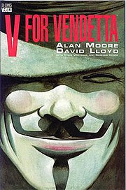
The best logos I have ever seen are the various versions incorporated in the V For Vendetta books and the movie. They are truly remarkably strong.
Purposes of Logo
These will be multiple:
- To attract favorable attention.
- To help distinguish the author’s name from the competition.
- To suggest a certain distinctive quality of writing.
- To enliven the look of all material associated with the author from book covers to websites, from letterheads to promotional banners
Characteristics of logo
- To be instantly recognizable.
- To be effective in both color and black and white.
- To be identifiable—in combination with a distinctive house style—on on a book cover from a reasonable distance (say 12 feet)
- When in color, to be bright and attention getting—primary colors preferred.
- To be scalable
- To be clear
Do I, the client, have any particular concepts in mind?
I have some vague thoughts which are not set in stone. Let me get them off my chest in no particular order.
- Primarily, I write thrillers—where the symbol of a helicopter is almost synonymous with the genre—but I also write social comment and humorous books too. Given a terrific thriller logo, I’ll inflict that on my other readers, but I thought I’d mention the dichotomy.
 I used to have a rather elegant letter heading in which the apostrophe in my name was replaced by a shamrock, but I don’t want to trade on the Irish connection in such a blatant way since I am actually Anglo-Irish. In fact, my mother married Terence O’Reilly after I was born so my real name was originally Lentaigne. Now the Lentaignes have been in Ireland since the late 18th century—the founder member fled from the French Revolution—so I identify more with that side of the family. The full family name is Lentaigne de Logivieres and they were aristocrats from Calvados, Normandy, France. Is there any potential in a Norman knight? The protagonist of all my books, Hugo Fitzduane, is also descended from a Norman knight, and his castle features in all my stories.
 A significant part of my first book was set in Bern, Switzerland. The symbol of Bern is a stylized bear and the coloring of the whole shield gives it unusual impact. Also, unlike many traditional coats of arms, it isn’t cluttered. It is absolutely clear.
- The current face being used for the title and author’s name on the book covers is Haettenschweiler. Internally, headings are set in Arial Black and body copy in Georgia 12.
 My friend, Tim Roderick, has suggested that a logo could be devised from the shape used to identify VOR (Visual Omnidirectional Range) since our initials are the same. I have no strong views on the matter. Right now it is bald and geometric but with the perimeter thickened and colored, and an image placed in the canter, it could look quite striking.
  My mother was born in Burma and a great uncle commanded the Chindits in WW II. Accordingly, the Chinthe could have relevance. The Chinthe is a leogryph (lion-like creature) that is often seen at the entrances of pagodas and temples inBurma and other Southeast Asian countries. The chinthe is featured prominently on the kyat, the currency of Burma. The chinthe is almost always depicted in pairs, and serve to protect the pagoda. They typically appear as animals, but are sometimes found with human faces.
  This is the badge of the actual Chindits (the Chinthe is illustrated in many different ways). Now since I wasn’t even born before the actual Chindits were formed in 1943—it would be improper to use it directly—but the coloring does have appeal, and I’m actually using it on book covers (without then knowing the Chindit association).
  This is a Dunguaire Castle—a classic Norman keep—essentially a square or rectangular tower—similar to the one featured in my Hugo Fitdzuane books. They were built all over Ireland after the Norman invasion 1169. However, the Normans intermarried with the Irish—and became “more Irish than the Irish themselves”—so English rule of Ireland did not really become oppressive (a relative term) until roughly 400 years later. Fitzduane’s castle, of course, has a flat roof.
To be continued…

No comments:
Post a Comment